
Keeping your print and online branding consistent
Your boxes, menus and banners are designed by printers; your website and profiles by someone else. Here's how to make sure what customers hold matches what they see on their phones.
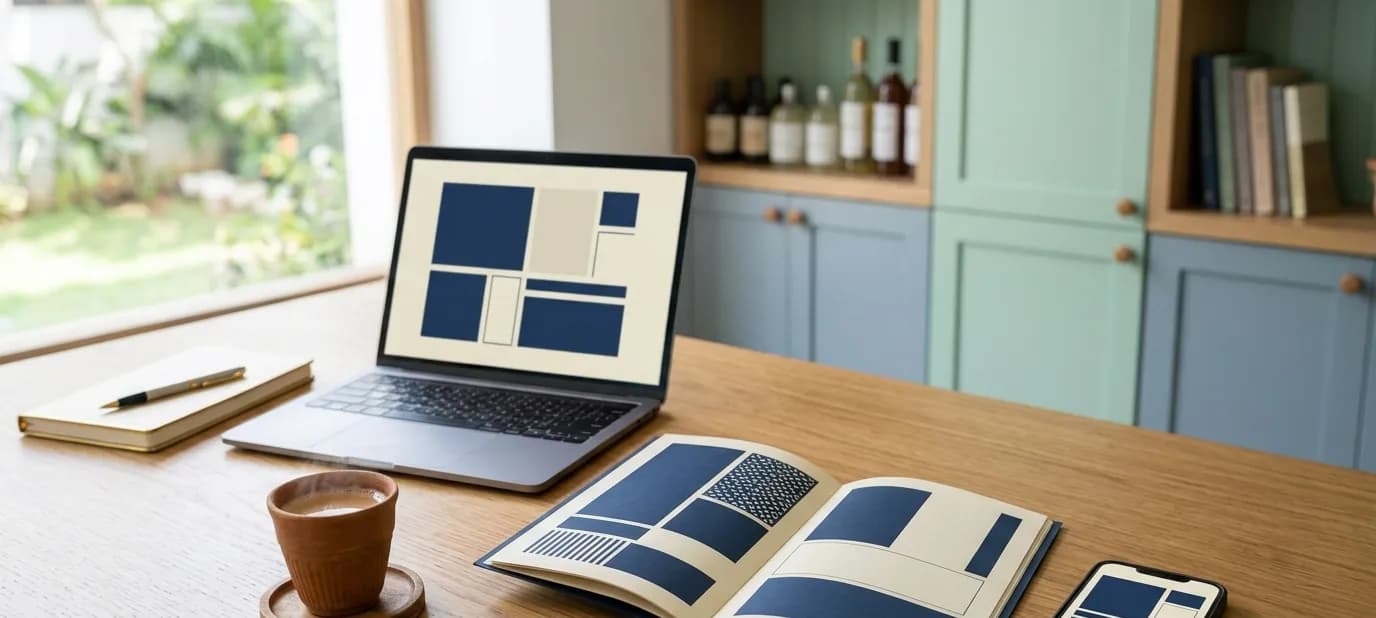
In many businesses, print and online grow up separately. The printer down the road designs the boxes and the menu card. A web designer, or a family member, makes the website and the Instagram. Nobody compares them, so over time they drift apart: different colours, different fonts, sometimes even a different version of the name.
Customers notice, even if they don't say so. This post explains why print and online should match, where they usually drift, and how to keep them together.
Why it matters
Customers move between print and online all the time. They take home your box and look you up on Instagram. They find your website and then see your banner at a wedding exhibition. They scan the QR code on your menu card and land on your website.
Each time, they're connecting the dots. When print and online look the same, every touchpoint reinforces the others. When they don't, your business feels less put-together than it really is. For the wider picture, see one look everywhere.
Where print and online usually drift apart
Colours
This is the most common problem. Colours are produced differently on screens and on paper, so a bright red on your website can print as a dull brick red, or a printer may simply pick the nearest ink they have. Without written colour codes for both, they'll never quite match.
Fonts
Printers often use whatever fonts are installed on their computer. The result is a menu card in one font and a website in another.
The logo
A blurry logo copied from WhatsApp, an old version of the logo, or a logo stretched to fit a banner.
Details
A visiting card with last year's phone number, or a box with the old address. These details should always match your Google listing and website. See NAP consistency.
How to keep them together
1. Have one set of brand files
Your logo in every version, your exact colours and your fonts, in one shared folder. Send the same link to your printer, sign maker and web designer. See brand guidelines explained.
2. Give colours for both screen and print
Your guidelines should list each colour as HEX or RGB for screens and CMYK for print. Some printers also work with Pantone colour references for very exact matching. See how to choose brand colours.
3. Always ask for a proof
Before a full print run, ask for a printed proof, and hold it next to your website on a phone. If the colours or fonts look off, fix them now, not after a thousand boxes are printed.
4. Use the same photos
If your website shows your shop and products, use the same real photos in brochures and menus. It ties everything together. See why real photos beat stock photos.
5. Connect them with QR codes
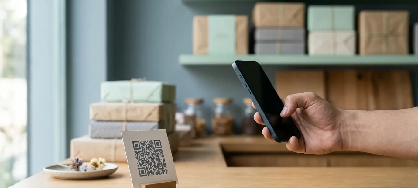
A QR code on your menu, box or bill can take customers straight to your website, WhatsApp or Google reviews. It turns print into a doorway to everything online. See QR codes for shops.
A real example
When we worked with Laxman Bikaner, a sweet shop and restaurant, we refreshed the brand, built the website with the full menu, set up the Google Business Profiles and designed print with QR codes. Because it was all done together, the printed material and the website share the same look, and the QR codes on the counter lead customers straight online.
Working well with your printer
Most printers do good work when they're given clear instructions. Send them print-ready files rather than a screenshot, tell them the exact colour codes, and ask what they need: bleed (a little extra around the edge that gets trimmed), resolution and file format. Ask them to tell you before they substitute a paper, ink or font. A short conversation at the start saves a reprint later.
A simple checklist
Lay out your printed items next to your phone and check:
- Is the logo the same version, sharp and not stretched?
- Do the colours look like the same colours?
- Are the fonts the same, or at least clearly related?
- Are phone, WhatsApp, address and website exactly the same as online?
- Is there a QR code, and does it lead somewhere useful and working?
Getting help
Our print design service designs business cards, brochures, signage, packaging and more in your brand, so what customers hold matches what they see online. We prepare print-ready files for your printer. If your brand itself needs work first, our brand identity service creates the logo, colours, fonts and guidelines everything else follows.
In short
- Customers move between print and online constantly, so both should look like the same business.
- Colours, fonts, logos and details are where they usually drift apart.
- Use one set of brand files with screen and print colour codes, check proofs, and connect print to online with QR codes.