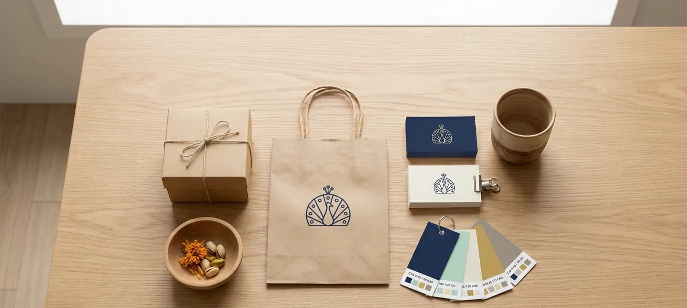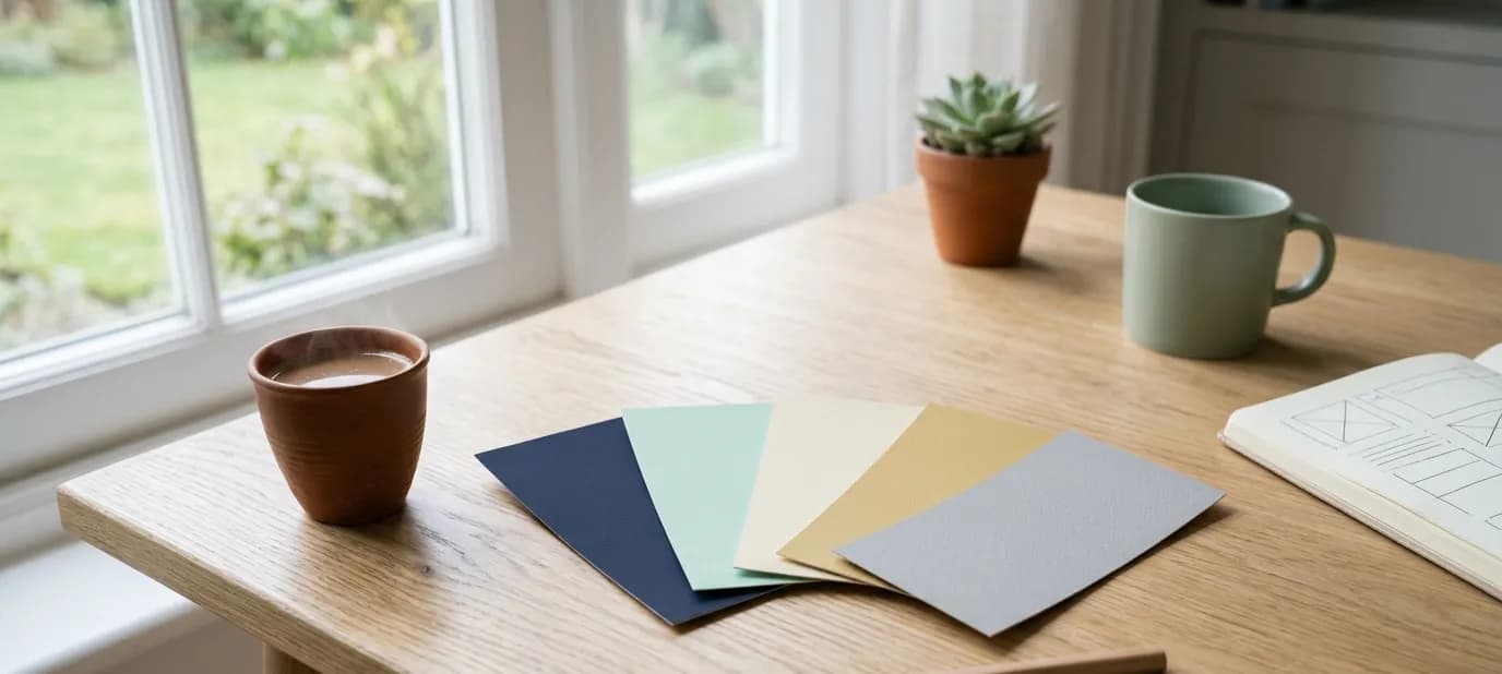

One look everywhere: your sign, website, profiles and print
Customers meet your business in many places: the shop sign, Google, Instagram, a box, a visiting card. When they all look the same, you look established and easy to recognise. Here's how to get there.

Think about all the places a customer might meet your business in a single week. They walk past your sign. A friend forwards your Instagram. They search on Google and see your listing. They order on Zomato. They take home a box with your name on it and keep your visiting card.
If each of those looks different, the customer has to work to connect them. If they all look the same, every single one reminds them of you. This post is about making that happen.
Why consistency matters
Recognition comes from repetition
People recognise a business by seeing the same thing again and again: the same logo, the same colours, the same name written the same way. Each mismatched version weakens that.
It signals care
A business whose sign, website and packaging all match looks organised and established. Customers assume the same care goes into the products and service.
It builds trust online
When your Google listing, website and social profiles look and read the same, customers are more confident they've found the right business, not a copy or an old listing. The same goes for your details: matching name, address and phone everywhere is called NAP consistency, and it matters to Google too.
Where your brand appears
Make a list. For most local businesses it includes:
- Shop sign, banners and window stickers
- Website and its small browser icon
- Google Business Profile: logo, cover photo and photos
- Instagram, Facebook and WhatsApp Business profile pictures and covers
- Zomato and Swiggy, if you're a food business
- Printed material: visiting cards, menus, bills, letterheads and brochures
- Packaging: boxes, bags, labels and stickers
- Staff uniforms or aprons, if you use them
Go through each one and ask: does this look like the same business as everything else?
What “the same” means
Consistency doesn't mean every item is identical. A sign and a visiting card are very different things. It means they share the same building blocks:
- The same logo, in the right version for the space
- The same colours, using the exact codes, not approximations. See how to choose brand colours.
- The same fonts for headings and text
- The same name, written the same way
- The same tone: if your website is warm and friendly, your Instagram bio shouldn't be stiff and formal
These building blocks are what brand guidelines write down.
How to get there without starting from scratch
You don't need to replace everything at once.
- Settle the basics first. Decide on your final logo, colours and fonts. If your logo needs work, see refresh or replace.
- Update everything online straight away. Profile pictures, cover images, your website and your Google listing can change in an afternoon, at no printing cost.
- Update print as you reorder. When visiting cards, boxes or menus run out, the new ones follow the brand.
- Plan the bigger items. Signs and banners can change when they're due for repair or replacement.
- Share the files. Give every printer and designer your logo files and guidelines, so nobody guesses.
Common mismatches we see
- A new logo online but the old one still on the sign and boxes
- An Instagram profile picture that's a random photo, not the logo
- A Google cover photo from years ago, before the shop was renovated
- A different shop name on Zomato from the one on the sign
- Five different reds across the sign, boxes, menu and website
Who looks after it
Consistency slips when nobody owns it. In a small business, choose one person, often the owner or a trusted family member, who approves anything new that carries the brand: a banner, a box reorder, a festival post, a new menu card. It takes a minute to check each item against your guidelines, and it saves a lot of reprinting and confusion later.
Connect print and online
Consistency works best when print and online point to each other. A QR code on your box can lead to your website or Instagram, and your website can show the same packaging customers will receive. See keeping your print and online branding consistent and QR codes for shops.
Getting help
This is what we mean by “everything connected”. Our brand identity service creates the building blocks, our social media setup brings your profiles in line, and our print design service does the same for everything customers hold. A free Google check is an easy way to see how consistent your business looks online today.
In short
- Customers recognise you by seeing the same logo, colours, fonts and name everywhere.
- List every place your brand appears and check each one matches the others.
- Update online profiles first, then print as you reorder, and share your files with everyone who makes things for you.