
Signage, packaging and labels: the basics
Your shop sign, boxes and labels are seen by more people than almost anything else you make. Here are the basics of getting them right: readable, recognisable and connected to your business online.

Your shop sign is seen by everyone who walks or drives past, every day. Your boxes and bags travel into homes, offices and family gatherings, especially at festival time. Your labels sit on kitchen shelves for weeks. Together, they're some of the most-seen pieces of your brand.
This post covers the basics of signage, packaging and labels for a small business: what matters, what to avoid and how to connect them to your business online.
Signage
Readability first
A sign has one main job: to tell people who you are, from a distance, in a few seconds. That means:
- Your name, large and clear. Not squeezed in among phone numbers and product lists.
- Strong contrast between the lettering and the background, so it's readable in bright sun and at night
- Few words. A sign packed with text is read by nobody.
- Lighting that works after dark, if you're open in the evening
Match your name everywhere
The name on your sign should be the same as on your Google listing, website and social profiles. When customers search for the name they saw on your sign, they should find you immediately. See NAP consistency.
Think about where it's seen from
Stand where your customers will be: across the road, in a passing car, at the end of the market lane. Can you read the name from there? Is it hidden by a tree, a pillar or a neighbour's banner? A sign that looks perfect on a designer's screen can disappear on a busy street. Size and position matter as much as design.
Don't forget smaller signs
- Opening hours on the door, matching your Google hours
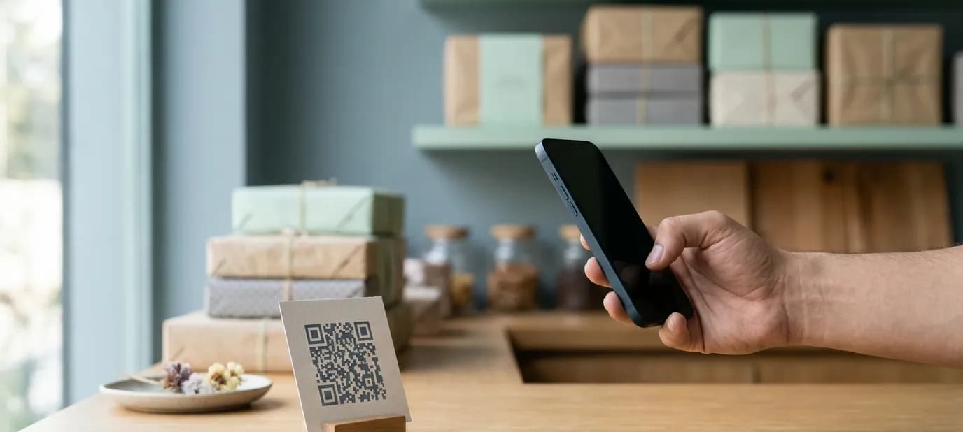
- A QR code at the counter for reviews, WhatsApp or your menu
- Directional signs if you're upstairs or inside a market
Packaging
Packaging is advertising
A box of sweets taken to a family gathering is seen by everyone in the room. A well-designed bag carried through a market is a moving advertisement. Packaging is one of the few places where your brand reaches people who haven't heard of you yet.
What good packaging includes
- Your logo and brand colours, applied cleanly
- Your name and one way to find you: a website, an Instagram handle or a QR code
- Practical information where needed, such as a sticker for contents, weight or date
- Space. Simple, uncluttered packaging often looks more premium than busy designs.
Festival and gift packaging
Many businesses do special packaging for Diwali, Raksha Bandhan, weddings or corporate gifting. Seasonal designs are a nice touch, but keep your logo and core colours, so the festive box is still recognisably yours.
Labels
Labels on jars, packets and bottles need to be both on-brand and clear.
- Product name large and easy to read
- Logo smaller, but always present
- Required details, such as ingredients, weight, dates or other information that applies to your products. Check what applies to your products with the relevant authority or an advisor.
- Consistent layout across the range, so your products look like a family on the shelf
- Readable text, even on small labels. Tiny, decorative fonts don't work here.
Connect print to online
Signs, boxes and labels are perfect places for a QR code. Common choices:
- Counter sign: QR code to leave a Google review
- Box or bag: QR code to your Instagram or website
- Label: QR code to reorder on WhatsApp
- Table tent in a restaurant: QR code to the menu
Use a link you can change later, and test every code before printing. See QR codes for shops.
Plan for reorders
Signs last for years, but boxes, bags and labels are reordered again and again. Keep the final print-ready files safe and share the same files every time you reorder, rather than asking the printer to “make it like last time”. Small changes creep in with every guess. If you change something, such as a new phone number, update the master file first, then print from it.
Common mistakes
- Too much text on the sign
- A different version of the name on the sign than online
- Low-quality logo files, which print blurry or pixelated
- Approximate colours, so boxes, sign and website all look slightly different. See keeping your print and online branding consistent.
- QR codes that don't scan because they're too small, too close to an edge or on a shiny surface
Getting help
Our print design service designs shop signage, banners, packaging and labels in your brand, with QR codes that lead to your website, WhatsApp or reviews. We prepare print-ready files for your printer or sign maker. For the brand itself, see our brand identity service.
In short
- Signs must be readable from a distance: your name, large and clear, matching your Google listing.
- Packaging and labels travel into homes, so keep your logo and colours on them, cleanly and simply.
- Add QR codes to signs, boxes and labels to connect print to your website, WhatsApp and reviews.