
Refresh or replace: when should you update your logo?
An old logo can carry years of trust, or quietly hold a good business back. Here's how to tell whether yours needs a gentle refresh, a full replacement or no change at all.
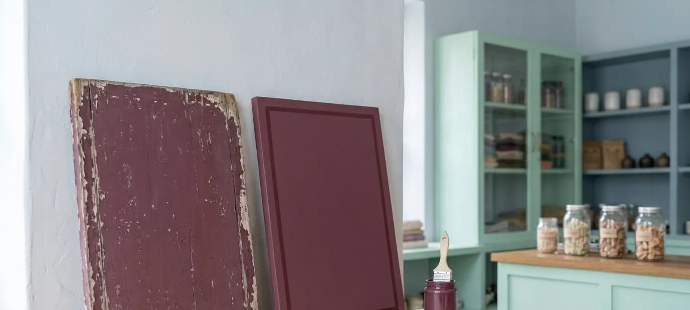
Many established businesses have a logo that was made quickly years ago: by a relative, by the printer who did the first visiting cards, or by the signboard painter. It has served well. Customers recognise it. But it may also look dated next to newer shops, or fall apart when it's shrunk to fit an Instagram profile picture.
This post helps you decide what to do about it: leave it, refresh it or replace it. If you're new to the idea of a brand, start with what is brand identity?
First, what your logo has already earned
Before changing anything, think about what your current logo means to people. If customers have seen the same sign above your shop for fifteen years, the shape, colours or lettering may be part of how they find you. Throwing that away can cost more than it gains.
That's why the question is rarely “new logo or not”. It's usually “how much should change?”
Three options
1. Leave it as it is
If your logo is clear, works at small sizes, prints well and still feels like your business, you may only need the rest of the brand around it: consistent colours, fonts and simple rules for using it.
2. Refresh it
A refresh keeps what customers recognise and fixes what doesn't work. Typical changes:
- Cleaner lettering that's easier to read on a phone
- Simplified details, so it survives being small on a profile picture or a box label
- Tidied colours, chosen deliberately instead of whatever the printer had
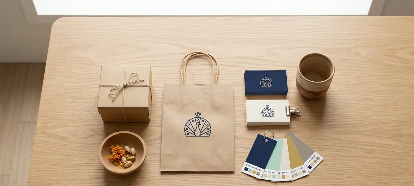
- Proper versions for light and dark backgrounds, and a compact version for small spaces
- Clean digital files, so it looks sharp everywhere
Customers still see “their” shop. It just looks more cared for.
3. Replace it
Sometimes a fresh start is right. That's usually the case when the old logo was never really used consistently, when the business has changed a lot, or when the logo is so unclear that customers don't connect it with you anyway.
Signs your logo needs attention
- It can't be read when it's small, such as on a phone screen or a profile picture
- You only have it as a blurry photo or a low-quality image, not proper files
- It looks different everywhere: one colour on the sign, another on the cards, another on Instagram
- It was copied from a template or clip art that other businesses also use
- It no longer fits what you do, for example a sweet shop that now also runs a restaurant
- It makes a good, established business look smaller than it is
Signs you should leave it alone
- Customers clearly recognise it and talk about it
- It's simple and readable at every size
- The only real problem is that it's used inconsistently. That's a guidelines problem, not a logo problem. See brand guidelines explained.
A real example
When we worked with Laxman Bikaner, a well-loved sweet shop and restaurant, we refreshed the brand rather than replacing it. The shop already had loyal local customers, so the aim was to make it look as established online and in print as it already was in the neighbourhood, without losing what people knew. The refreshed brand then went onto the new website, the Google profiles and the printed material.
Planning the change
A logo change touches more places than people expect. Make a list before you start:
- Shop sign and any banners
- Visiting cards, bills and letterheads
- Boxes, bags and labels
- Website and favicon (the small icon in the browser tab)
- Google Business Profile, Instagram, Facebook and WhatsApp profile pictures
- Zomato, Swiggy or any other platform you're on
You don't have to change everything on the same day. Online profiles can switch at once. Printed items can change as you reorder them, and the sign when it's due for repair. What matters is that the new version is used everywhere from then on. More on that in one look everywhere.
Questions to ask a designer
- Will you show me a refresh option as well as a new design?
- Will I get versions for light and dark backgrounds, and a small version?
- Will I get files for both print and online use?
- Will you give me simple guidelines on colours and fonts?
Getting help
Our brand identity service covers both: we can refine a logo that already means something to your customers, or create a new one, along with colours, fonts and simple guidelines. Everything is ready to use on your website, profiles and print.
In short
- An old logo may carry years of recognition, so think before throwing it away.
- A refresh keeps what customers know and fixes readability, colours and files; a replacement suits logos with little recognition.
- Plan where the logo appears and switch every place to the new version over time.